5.5.10
Earth's Best Organic Baby Food
This is a redesign of Earth's Best Organic baby food. Before it had no shelf presence, now it can stand out against the primary colored sea of the baby food isle. The point was to make it really easy for the consumer to spot out our product (the best choice for their baby of course) and grab it and go.

R3
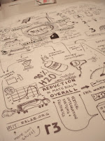
For this project four students were chosen to create a promotional poster for R3 (www.r3lab.org). It's all about designers that try to rebrand and redesign products that will change peoples lifestyles and make them more eco-friendly. There were two posters and for this one my partner Kris and I decided to hand draw the thought process we all went through at the beginning of the class.
4.5.10
Matrix
These are from my second year at the Academy. We created card sets to capture a concept relating to our chosen typeface, in this case it was Zuzana Licko's Matrix. The concept was inspired by the forty-five degree angels that make up the typeface, and so every card has some relation to 45 in the form of film strips, mph, and even the 45th element.
Typography
This book was a typographic exploration of the typeface Filosofia, while also being serving as a sort of diary/scrapbook of my life. My stories were told using hand drawn type, my own photos, and Filosofia.
Vibe by STAX Records
This lamp was design inspired by STAX records, a leading record company that signed soul, r&b, funk, and blues musicians. Otis Redding was one of their artists and is featured as the selling point on the lamp I designed inspired by STAX. The Vibe is the same size as a record and even comes with a sleeve. The box is not meant to be thrown away but used as a secret hiding spot. When it's put on a shelf alongside other records it's spine blends in.
C&H Annual Report
This is an annual report for C&H sugar. I wanted the book to look as sweet as the sugar, and really connect to the kid inside every CEO and chairman and business man or something...
Seabright Beer
Manetain
Manetain was part of R3 (visit www.r3lab.org) and is a sustainable and recyclable product line of powder shampoos. The goal was to come up with product designs that would change peoples behavior to become more eco-friendly. In this case the target audience, women, would be using less water and packing waste if they switched from liquid shampoo to dry shampoo. The first half of the book, Nice Is Naughty, describes why shampoo is bad. The second half, Naughty is Nice, refers to the girl who is not afraid to break tradition and is willing to give up 30 minute showers to clean her hair.

Chipotle
Chipotle worked with my class to come up with campaign ideas for them. The Ministry of Integrity is an online organization hosted by Chipotle that connects bloggers, farmers, activists, people who love good food, and people who love the world. We designed a voice and style that would be hard to ignore and that would get people to ask questions as a result of its ambiguity.
Subscribe to:
Comments (Atom)


